Case study
Case study
MoneyHero Group: Credit Card Journeys
Four markets, one decision architecture. How we rebuilt the credit card experience from campaign entry to application handoff across Singapore, Hong Kong, Taiwan, and the Philippines.

Kamil Gottwald
4 min read

Between February 2024 and December 2025, we worked embedded within MoneyHero Group to redesign the credit card experience end-to-end. Traffic was strong across all markets. The decision architecture, product presentation, and information capture flows weren't keeping pace.
- Client: MoneyHero Group (NASDAQ: MNY)
- Markets: Singapore · Hong Kong · Taiwan · Philippines
- Industry: FinTech · Personal Finance Comparison
- Engagement: February 2024 to December 2025
The challenge
High-intent users were arriving from paid and owned channels. The journey wasn't fully optimised to convert that intent to applications.
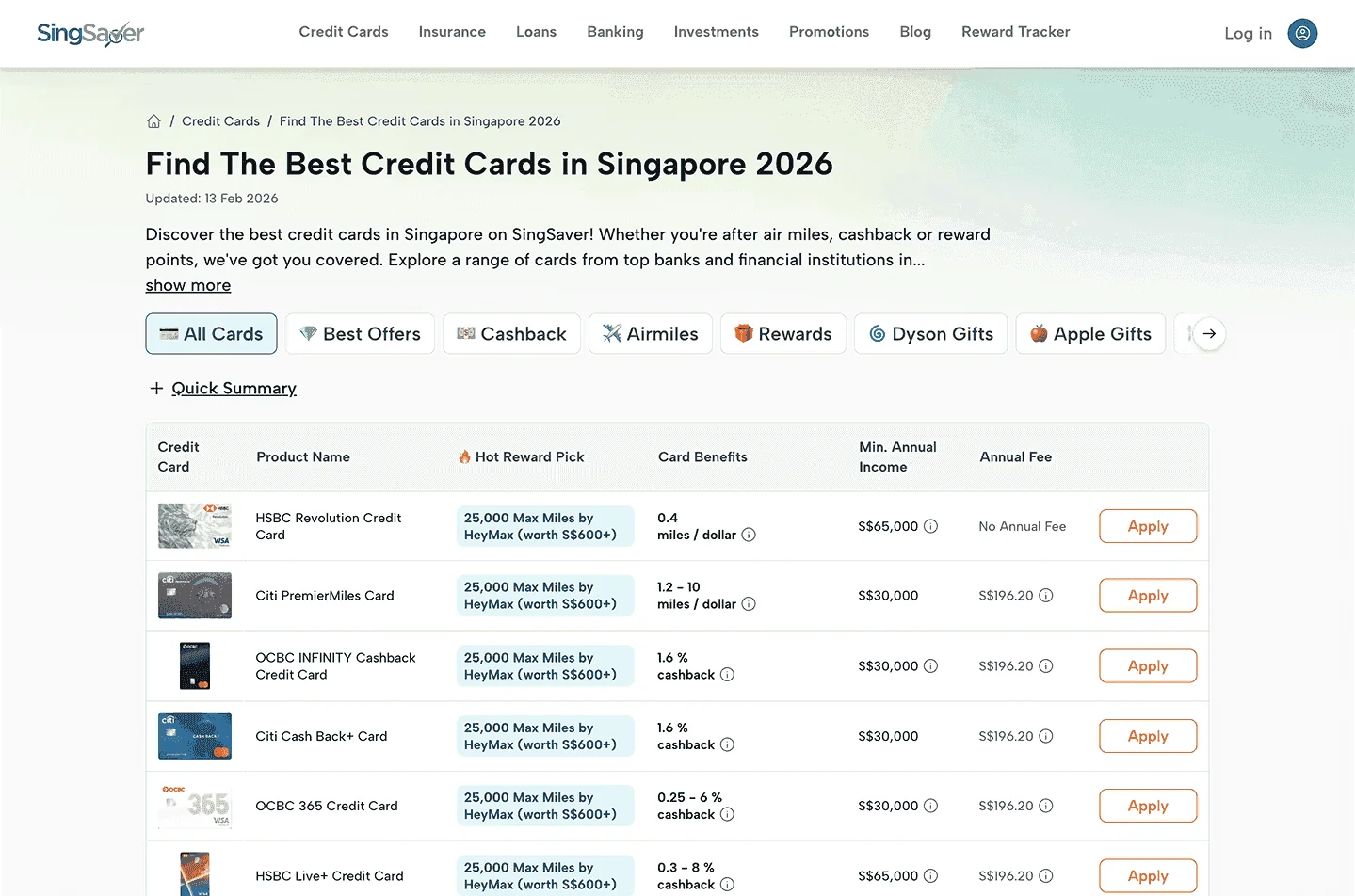
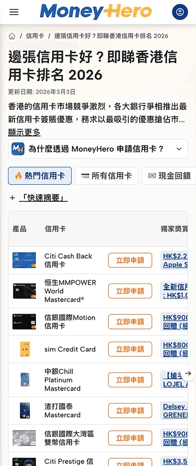
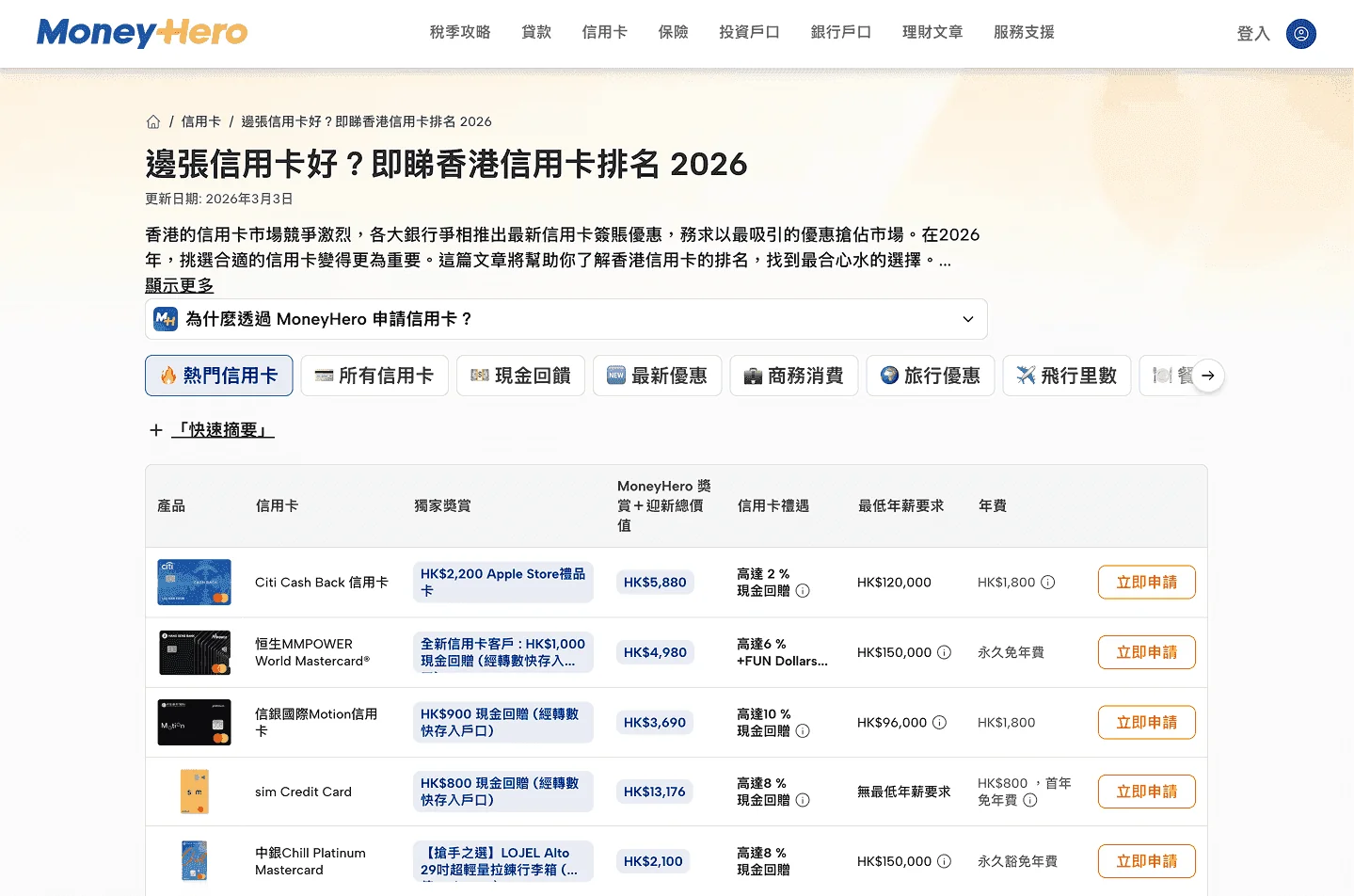
Campaign pages didn't reflect users' recent intent. Results pages displayed long, undifferentiated card lists, with filtering and sorting logic that varied by market without a clear rationale. Product detail views were built for desktop and worked poorly on mobile: users couldn't quickly compare benefit structures or assess coverage differences in the context where most of them were actually making decisions.
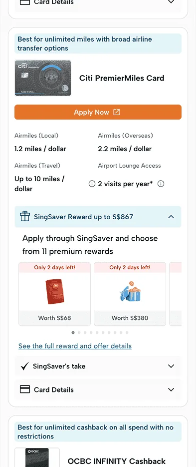
Platform rewards and issuer benefits were blended throughout, making it unclear what the platform was offering versus what the bank provided. That ambiguity mattered more than it appeared to.
The information capture step before handoff to providers added friction at exactly the wrong moment. Users were asked for details before understanding what they were committing to, and the flow varied by market without clear structural reasoning.
The cultural dimension made this harder to diagnose. In English-language markets, ambiguity reduced trust. In Mandarin and Cantonese markets, incomplete information reduced confidence. Different surface problems, same underlying cause.
What we did
Working embedded with growth, product, engineering, analytics, and local market teams, we rebuilt the credit card journey from campaign entry through to application handoff.
Restructuring the decision sequence
We reversed the campaign logic so users declared reward intent before viewing card lists, then built dynamic card views around that intent. Platform incentives and issuer benefits were separated with a consistent hierarchy throughout. Comparison modules were redesigned to show plan differences clearly before users applied.
Redesigning product result pages
The core results page was rebuilt as a mobile-first design. Card presentation prioritised scannability: clear benefit hierarchies, mobile-optimised comparison tables, structured product information that balanced coverage detail with campaign messaging. Modal-based product detail views replaced the cluttered desktop layout, allowing users to explore cards without losing context.
Comparison functionality was redesigned to work on mobile without horizontal scrolling or layout collapse. Progressive disclosure allows users to go deeper only when needed.
Streamlining pre-application capture
Required fields were reduced. Form logic was tightened. Progressive validation improved completion rates. The step was clearly labelled as preparation for the application, not the application itself. A small framing change made a measurable difference.
Scaling across markets and products
Filters, sorting logic, and product presentation were unified across all four markets. The same structural approach extended beyond credit cards to loans, bank accounts, and investment products, all built from a consistent decision architecture.
A tokenised cross-brand design system handled component logic, hierarchy, and spacing, with market and language variations managed through tokens rather than layout rebuilds. The system was built as modular Strapi CMS sections, so new templates for other pages and markets could be created without rebuilding the core structure.
Measuring and iterating
Structural variations were prototyped and tested on live traffic, typically within a week per cycle. Conversion data was reviewed regularly through internal analytical dashboards. MS Clarity session replays informed iteration. Every change was measured before scaling.
Results
"Kamil and his team diagnosed where our journeys were breaking and redesigned them end-to-end. The travel insurance work was the clearest example: real conversion improvements across both Singapore and Hong Kong. They embed fast, move at product speed, and the impact sticks."
Rohith Murthy, Group CEO, MoneyHero Group
Live credit card journeys:
Methods: Journey Mapping · Mobile-First Architecture · Reward-First Decision Logic · Product Detail Redesign · Comparison Table Optimisation · Modal-Based Product Views · Pre-Application Flow Simplification · Tokenised Design System · Strapi CMS Modular Sections · Rapid Prototyping · A/B Testing · AI-Assisted Prototyping · MS Clarity Behavioural Review · Looker Dashboard Analysis · Cross-Market Rollout Strategy · Cross-Product System Extension
This case study reflects the consultant's direct experience working with the MoneyHero team and is shared for illustrative purposes only.
Related: Why performance design differs from traditional agency work · How we rebuilt activation for a 3-million-user platform
Next Up

Case study•3 min read
SingSaver & MoneyHero: Travel Insurance
75% reduction in time to buy. How we rebuilt the comparison and checkout experience across Singapore and Hong Kong as travel demand recovered.
Mar 19, 2026

Case study•4 min read
OnlinePajak: Rebuilding Activation for 3 Million Users
290% uplift in onboarding-to-first-filing conversion. How flow-three rebuilt OnlinePajak's activation and closed the signup-to-first-transaction gap.
Mar 18, 2026
Most platforms already have the traffic. The problem is what happens to it.
Let's Talk
Where are your users getting stuck?
First call is always diagnostic. You describe where the numbers feel wrong — most of the time, we can identify the cause before we’ve seen the product.
Not a pitch. A look at the problem together.