Case study
Case study
SingSaver & MoneyHero: Travel Insurance
75% reduction in time to buy. How we rebuilt the comparison and checkout experience across Singapore and Hong Kong as travel demand recovered.

Kamil Gottwald
3 min read

As travel demand rebounded in 2024-25, conversion rates across SingSaver in Singapore and MoneyHero in Hong Kong did not improve at the expected pace. Friction ran from comparison through checkout. We rebuilt the decision journey to restore progression and grow revenue per purchase.
- Client: MoneyHero Group (NASDAQ: MNY)
- Markets: Singapore (SingSaver) · Hong Kong (MoneyHero)
- Industry: FinTech · Insurance Comparison
The challenge
Traffic was reaching comparison pages. Purchases weren't following.
Plan cards were dense and visually uniform. Users had to scroll and interpret the text extensively before they could distinguish coverage. The content hierarchy made confident selection difficult: everything looked equally important, so nothing did.
At checkout, the Personal Information step was among the highest-abandonment points on both platforms. Early form effort, repeated data entry, and late validation all slowed progression. These drop-off points had a meaningful impact on purchase completion.
What we did
We mapped the full journey from media entry to purchase, then rebuilt the decision architecture at comparison, checkout, and upsell.
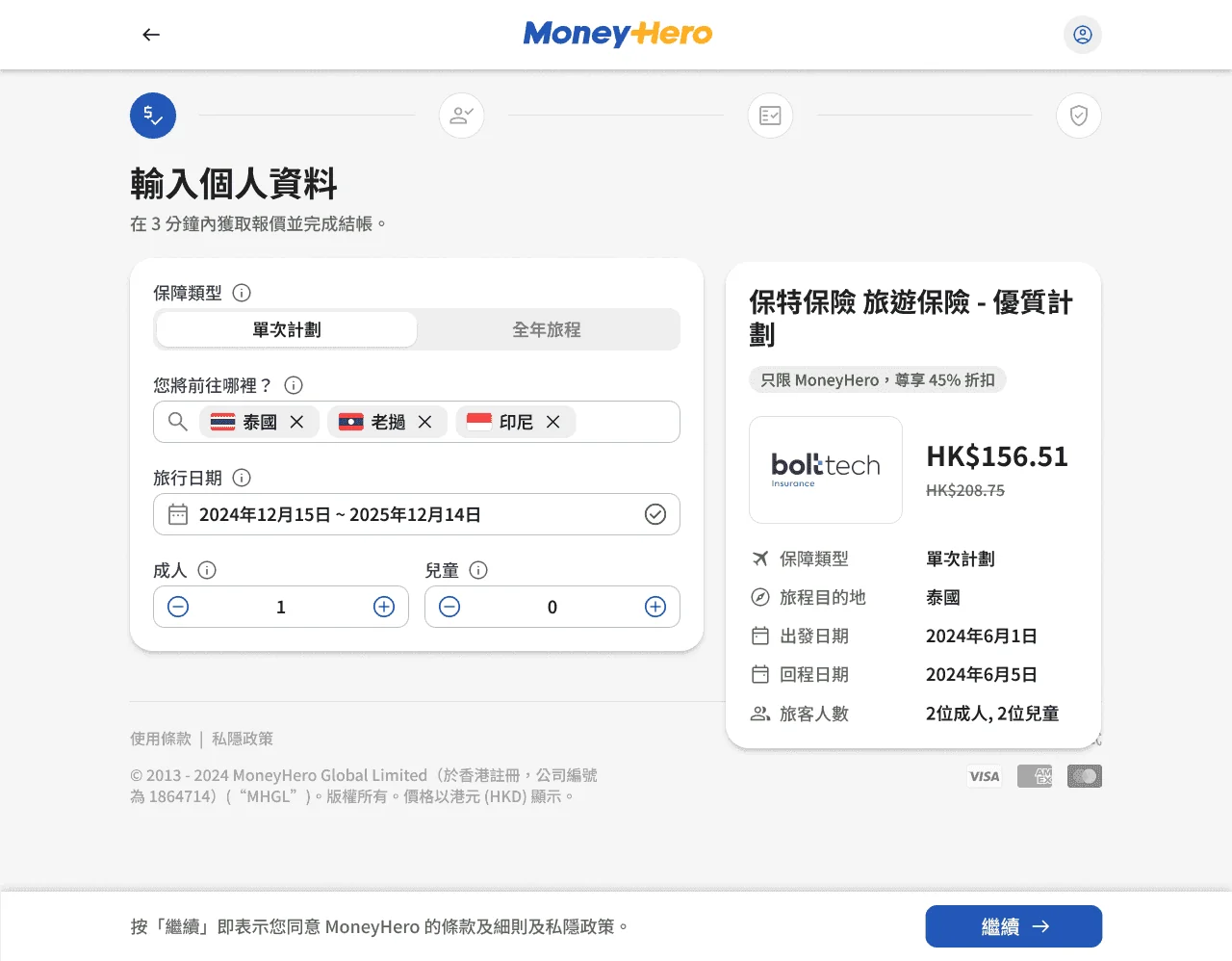
Comparison
We introduced a clear tier hierarchy so users could differentiate plans at a glance. Benefit summaries were simplified. Mobile density was reduced. A consistent messaging voice was applied across all product cards.
Checkout
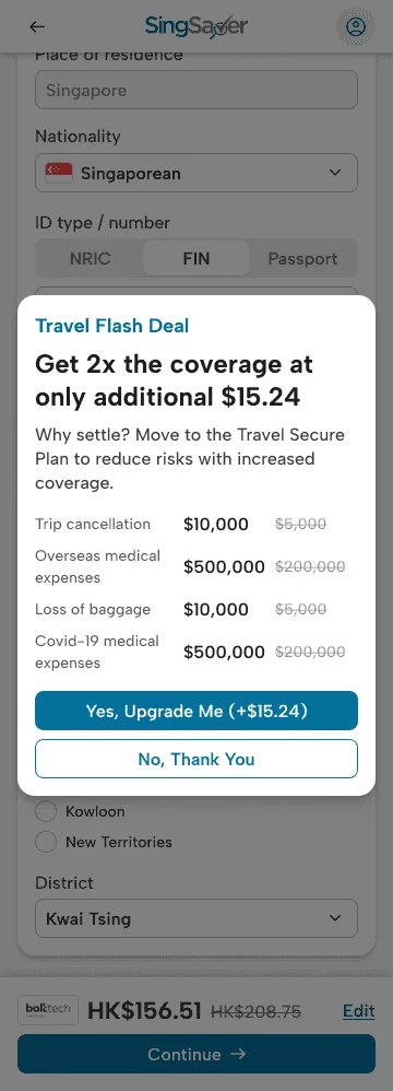
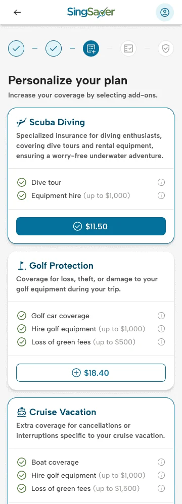
The Personal Information step was restructured: T&Cs and optional fields deferred to later stages. Google login with pre-fill added for returning users. When sufficient data was available, users bypassed the step entirely and proceeded to the review screen. The form was designed mobile-first throughout.
Upsell and performance tracking
Contextual upsells were placed inside the Personal Information step, not post-purchase. Provider-specific add-ons were enabled, starting with Singapore. Google Analytics and Microsoft Clarity were embedded across all funnel stages from day one, with session replays and heatmaps used to drive continuous iteration.
Singapore was validated first. Improvements rolled out to Hong Kong in staggered batches from December 2024 to January 2025, adapted for local expectations with shared components maintained.
Results
0%
Reduction in time to buy
The work was recognised externally. MoneyHero Group won the Digital - Insurance Broker accolade at the SBR Technology Excellence Awards 2025 — an award specifically citing the three-click travel insurance purchase experience delivered across Singapore and Hong Kong.
"They redesigned our platform with a genuine focus on conversion. Embedded across the whole organisation: product, growth, engineering, analytics. Each fix compounded the last. That cumulative impact is what you're hiring for."
Jaga Thangaiah, Group Head of Product, MoneyHero Group
Live pages:
Methods: User Journey Mapping · Conversion Funnel Analysis · Decision Architecture Redesign · Mobile-First UI Design · Checkout Simplification · Upsell Strategy Design · Content & Messaging Hierarchy · GA & MS Clarity Performance Tracking · Cross-Market Rollout Strategy · Design System Alignment · Prototype Testing
This case study reflects the consultant's direct experience working with the MoneyHero team and is shared for illustrative purposes only.
Related: The credit card journeys project across four markets · What performance design means in practice
Next Up

Case study•4 min read
MoneyHero Group: Credit Card Journeys
Four markets, one decision architecture. How we rebuilt the credit card experience from campaign entry to application handoff across Singapore, Hong Kong, Taiwan, and the Philippines.
Mar 20, 2026

Case study•4 min read
OnlinePajak: Rebuilding Activation for 3 Million Users
290% uplift in onboarding-to-first-filing conversion. How flow-three rebuilt OnlinePajak's activation and closed the signup-to-first-transaction gap.
Mar 18, 2026
Most platforms already have the traffic. The problem is what happens to it.
Let's Talk
Where are your users getting stuck?
First call is always diagnostic. You describe where the numbers feel wrong — most of the time, we can identify the cause before we’ve seen the product.
Not a pitch. A look at the problem together.