Case study
Case study
OnlinePajak: Rebuilding Activation for 3 Million Users
290% uplift in onboarding-to-first-filing conversion. How flow-three rebuilt OnlinePajak's activation and closed the signup-to-first-transaction gap.

Kamil Gottwald
4 min read

OnlinePajak had 3 million registered users and a product that worked. Indonesian businesses were using it to manage VAT, withholding tax, e-invoicing, and compliance obligations that would otherwise require manual coordination across disconnected processes.
What it didn't have was a design function.
- Client: OnlinePajak
- Market: Indonesia
- Industry: B2B SaaS · Tax & Compliance
The activation problem
As OnlinePajak scaled and added modules for e-Invoice, reporting, and tax filing, those modules grew in parallel rather than as a system. Each one made sense on its own. Together they created a product that was hard to navigate if you hadn't been using it since the beginning.
Dashboards were dense. Submission steps repeated information users had already provided. Validation errors appeared late in flows where catching them early would have made a material difference to completion rates. Status labels differed across modules: a document could be "draft" in one place and "pending review" in another for what was functionally the same state. Users couldn't tell where they were in a process, or whether they'd completed it.
Hesitation built across steps. Users dropped before completing revenue-generating actions. Others signed up and never activated at all.
There was no design function to diagnose or fix it. That was the starting point.
What we did over 18 months
We embedded across product, engineering, marketing, and the C-suite, working across three streams simultaneously.
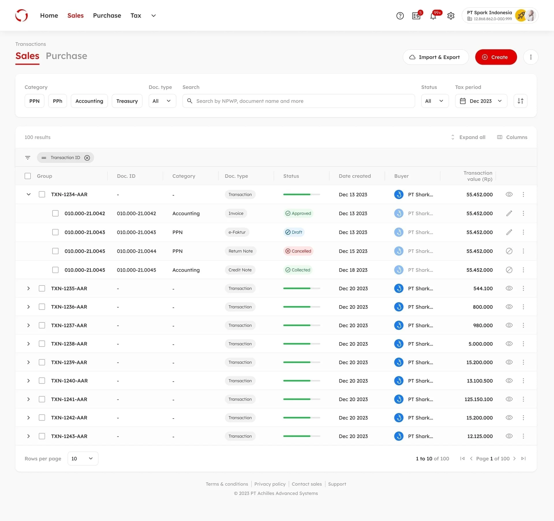
The core transaction experience was redesigned around a single organising concept: "1-Transaction," one unified flow covering accounts receivable, accounts payable, and compliance obligations. Validation moved earlier in the process. Duplicate inputs were cut. Status states were standardised across modules. Every screen was reduced to one clear action.
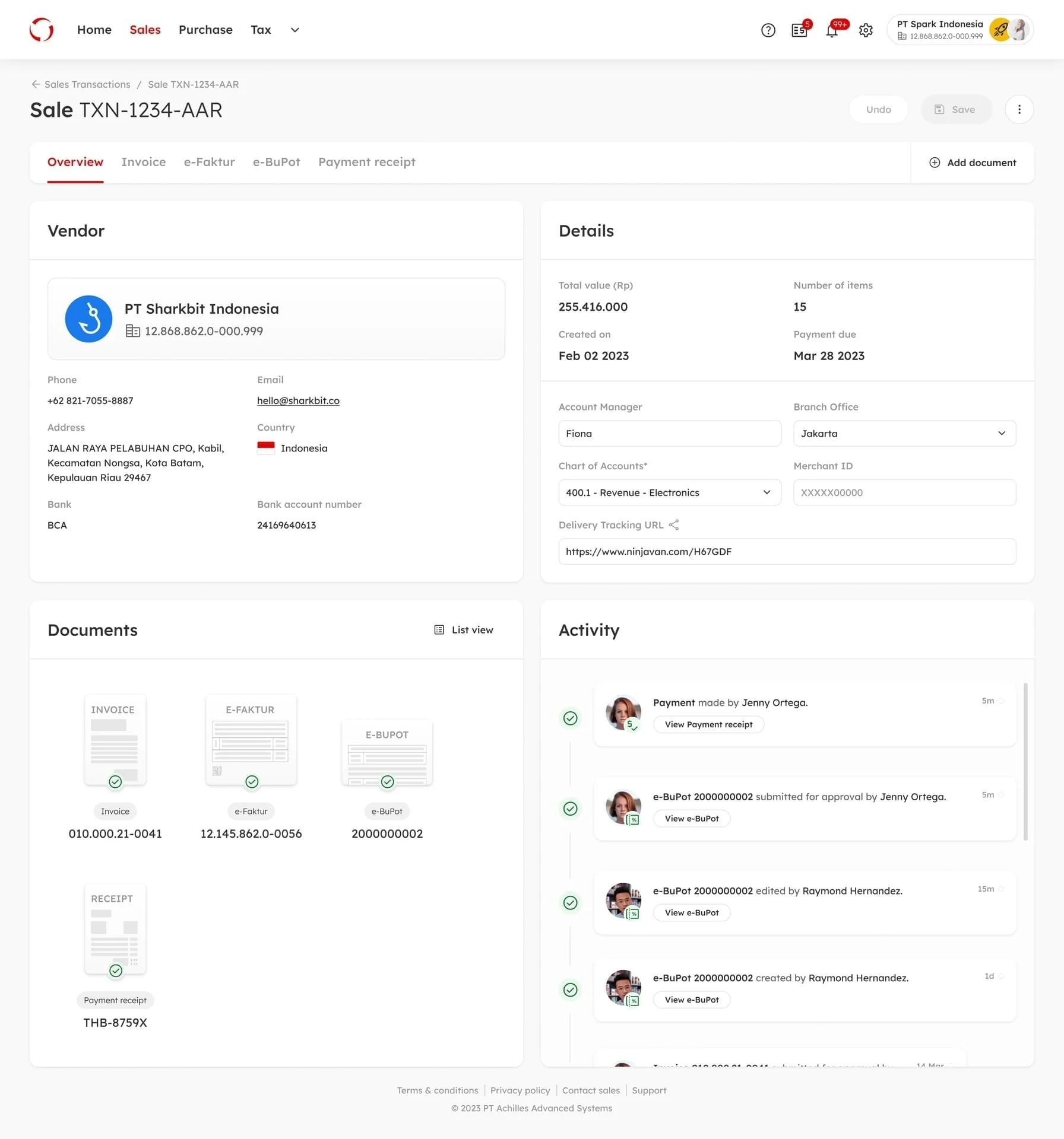
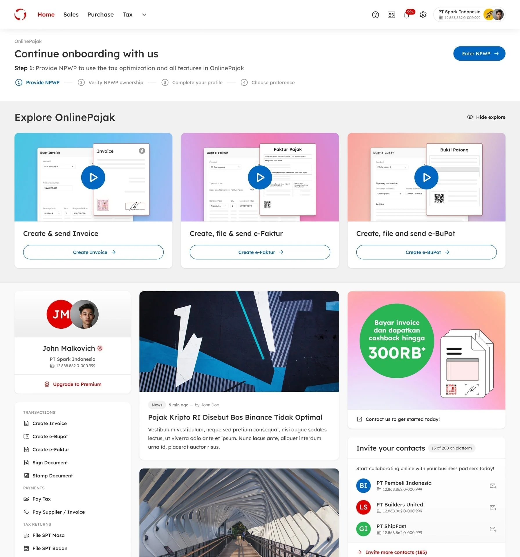
Fixing activation required more than structural redesign. We mapped journeys end-to-end to find where newly onboarded companies were stalling, then ran user interviews to understand why. The finding was instructive: users weren't failing because the product didn't work. They didn't know what to do next. The content gap was as consequential as the structural issues. Interactive tutorials addressed this directly, and the activation numbers moved.
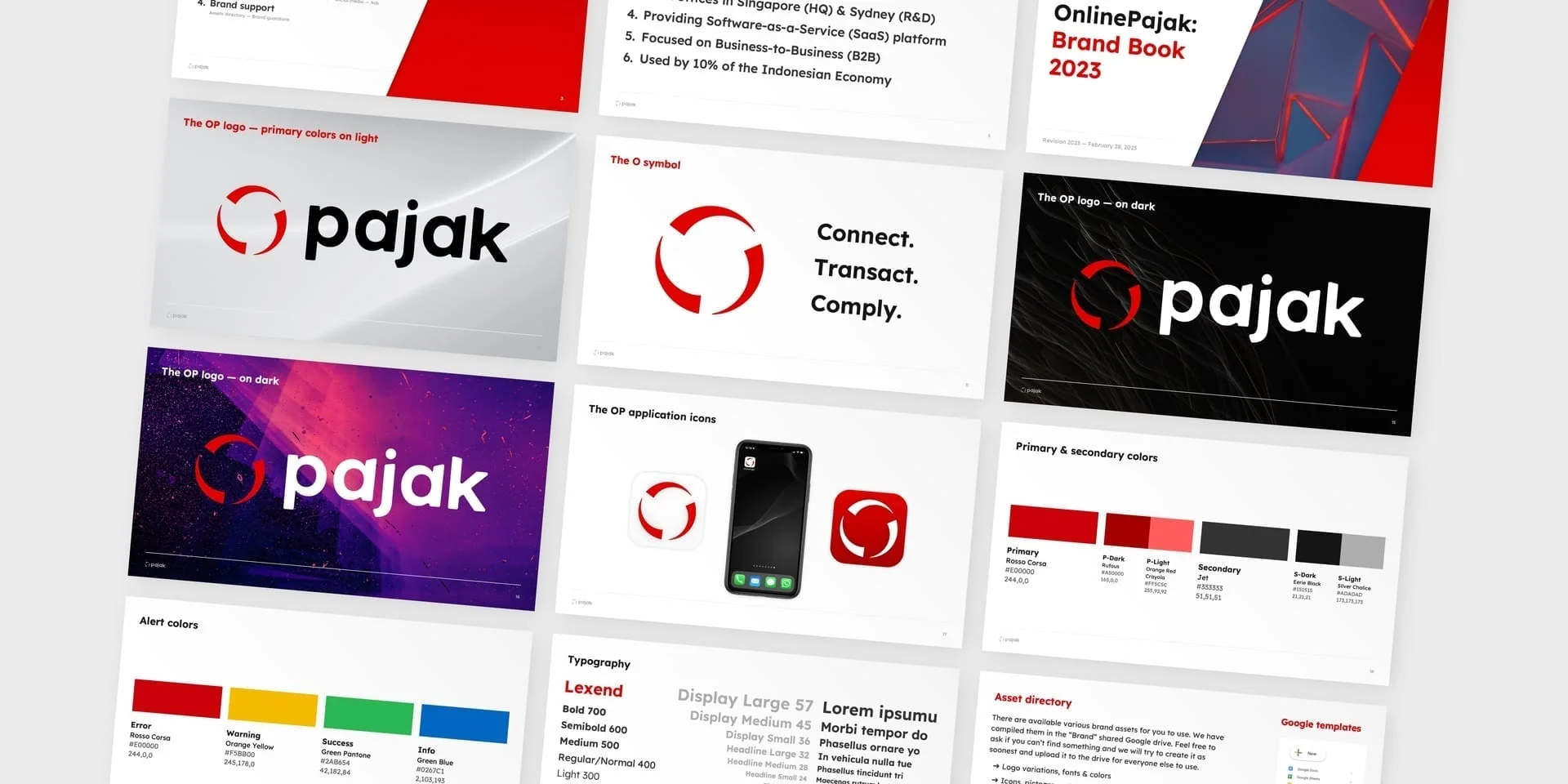
The foundation work ran alongside the flow redesign. We built a design system from scratch, integrated with the front-end Vuetify library. The team scaled from zero to 10 designers and researchers at peak. A full brand refresh, including brand book, visual identity, and marketing site, shipped alongside the product relaunch in Q2 2023.
On the content gap finding
This is worth making explicit because it's not the obvious diagnosis when a platform has low activation.
The assumption is usually that the product is too complex, the onboarding is too long, or the UX is confusing. All of those were partially true here. But the most consequential thing we found in user interviews was simpler: people didn't understand what they were supposed to do first. Not because the UI was unclear, but because nobody had told them.
Adding structured guidance at the right moments in the onboarding flow moved activation more than any single structural change. The product had always been capable of getting users to first filing. It just hadn't been showing them the way.
Results
0%
Increase in onboarding-to-first-tax-filing conversion
0%
Increase in completed e-Invoice submissions
0%
Reduction in submission errors after validation improvements
Three significant numbers across different parts of the same system. The validation improvement (79%) is the one that compounds quietly: fewer errors means fewer abandoned submissions, fewer support contacts, and higher user confidence in the product going forward.
Methods: User Journey Mapping · Activation Flow Redesign · Conversion Funnel Analysis · User Research & Interviews · Onboarding Content Strategy · Form & Validation Optimisation · Design System Build · Information Architecture · Brand Identity & Marketing Site
If your platform has activation you can't close from the inside, let's talk.
Related: What performance design is and why it's different · Form friction: the data to fix it already exists
Next Up

Case study•4 min read
MoneyHero Group: Credit Card Journeys
Four markets, one decision architecture. How we rebuilt the credit card experience from campaign entry to application handoff across Singapore, Hong Kong, Taiwan, and the Philippines.
Mar 20, 2026

Case study•3 min read
SingSaver & MoneyHero: Travel Insurance
75% reduction in time to buy. How we rebuilt the comparison and checkout experience across Singapore and Hong Kong as travel demand recovered.
Mar 19, 2026
Most platforms already have the traffic. The problem is what happens to it.
Let's Talk
Where are your users getting stuck?
First call is always diagnostic. You describe where the numbers feel wrong — most of the time, we can identify the cause before we’ve seen the product.
Not a pitch. A look at the problem together.